BENT.
The BENT. catalogue was featured as a finalist in the Communication Arts 2020 Design competition.
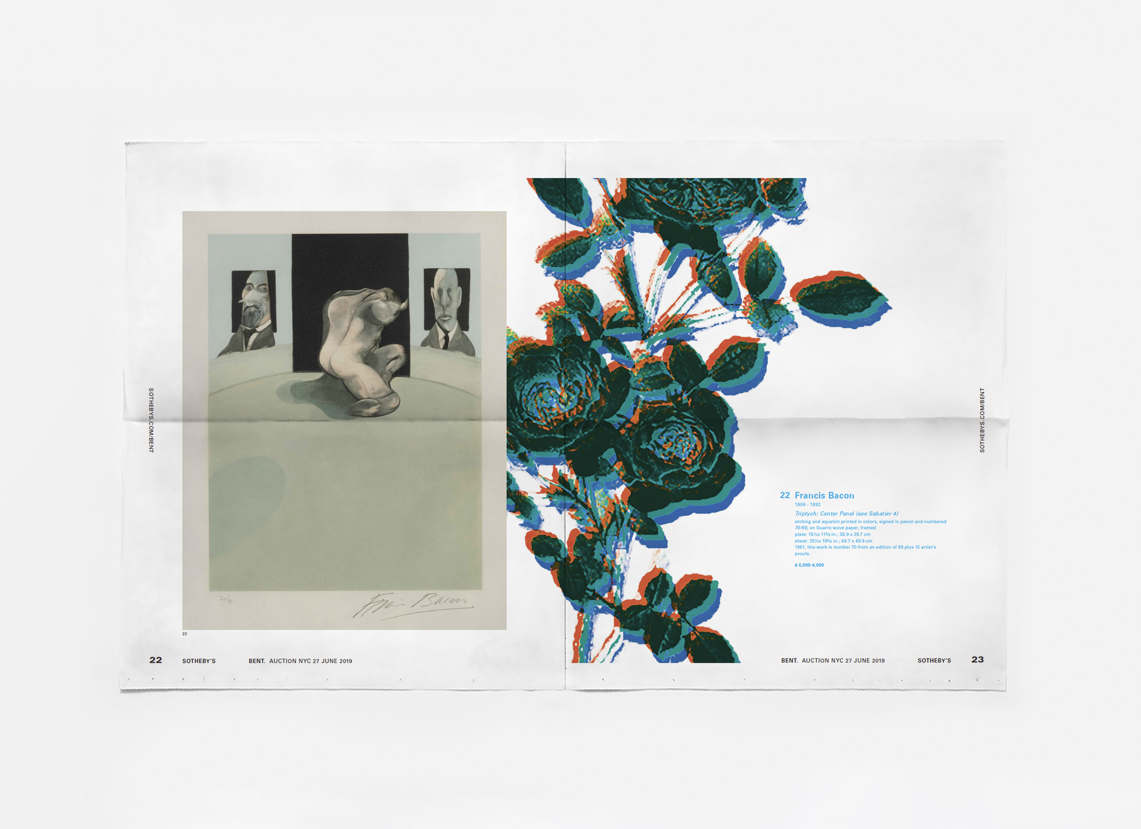
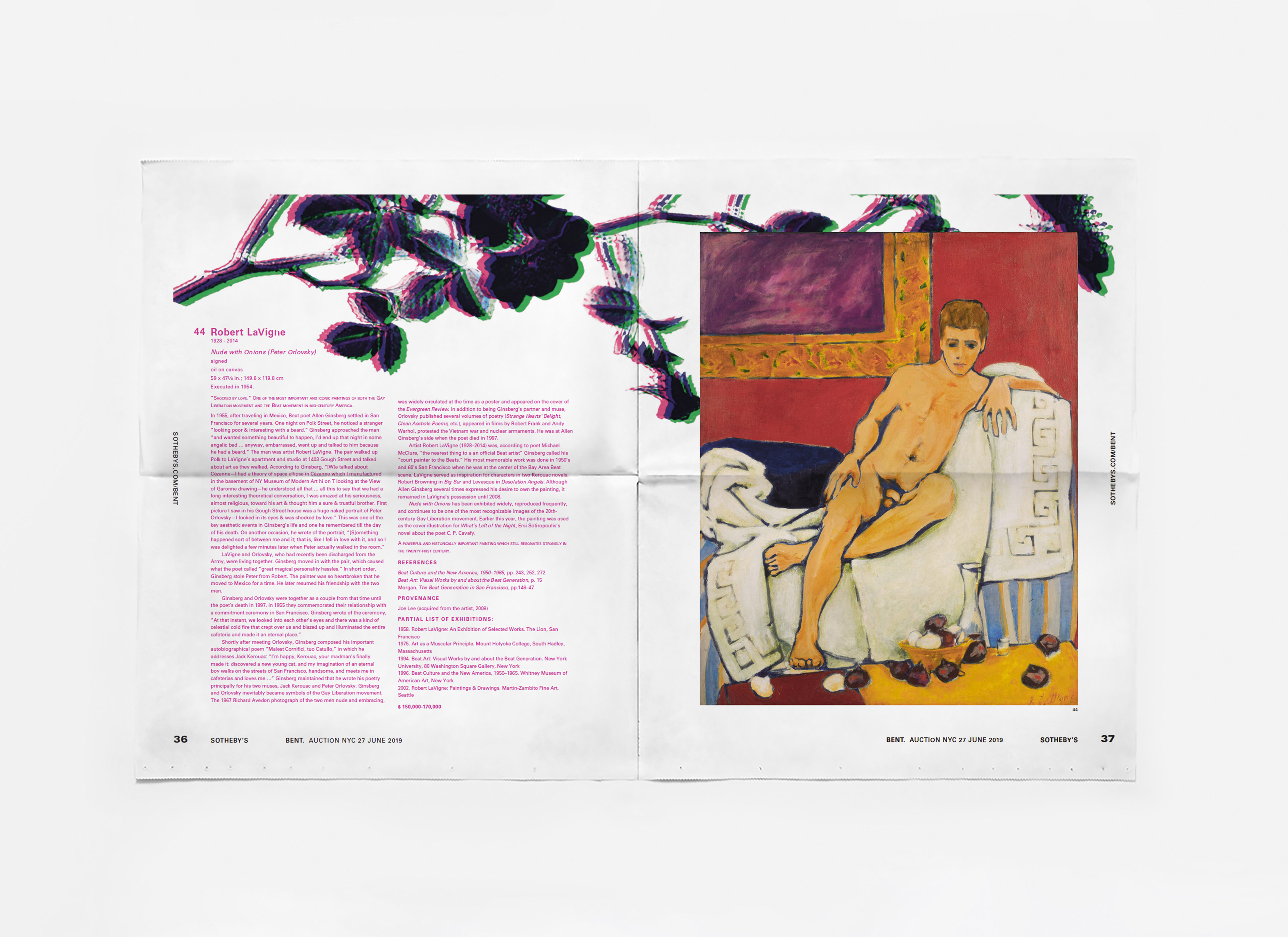
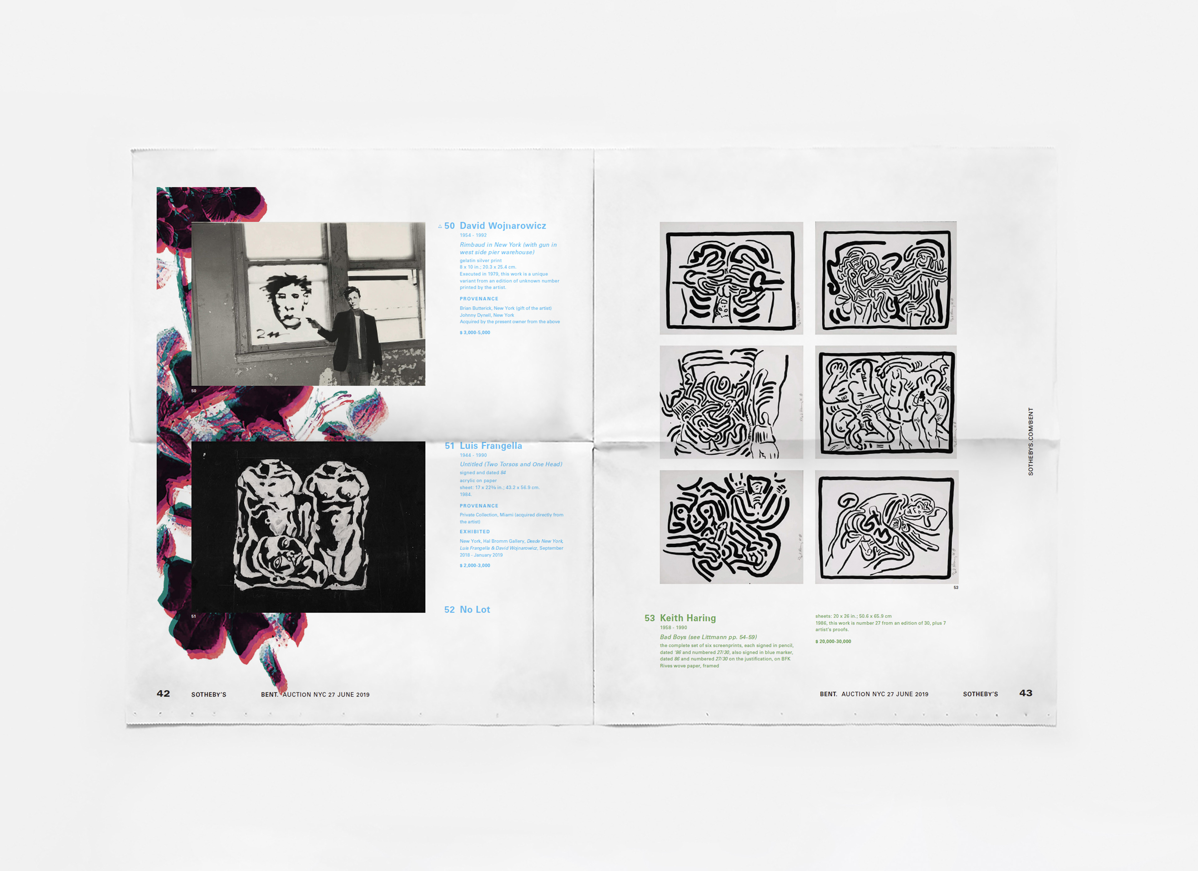
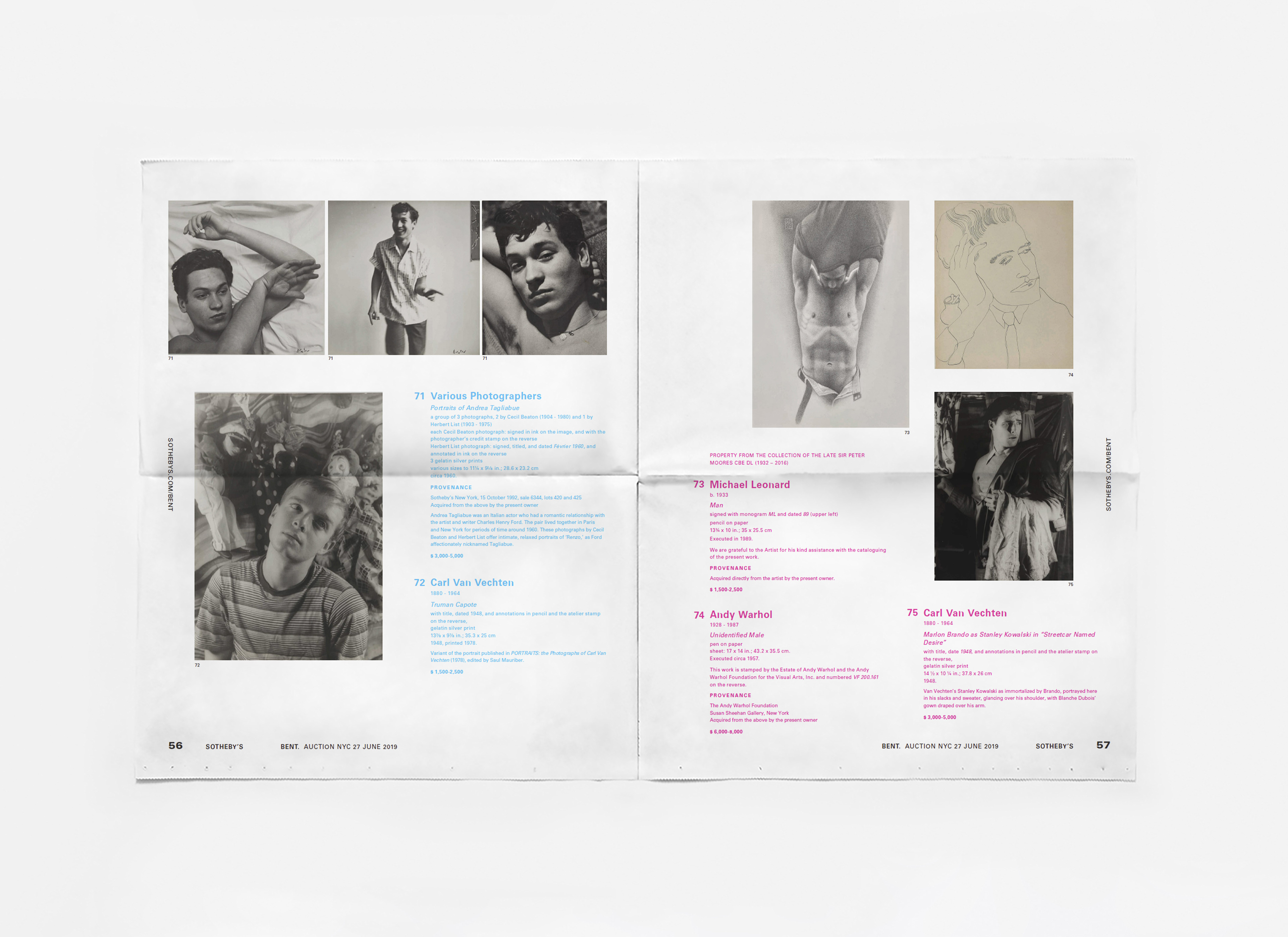
BENT. was a curated Sotheby’s New York sale celebrating LGBTQ+ artists for WorldPride and the 50th anniversary of the Stonewall riots. The visual identity draws on the community’s history—from the AIDS crisis to the Stonewall riots to eras when living openly was dangerous. Antique wallpaper motifs evoke an imagined “safe space,” hinting at the coded lives queer people were forced to lead. I also referenced symbolic touchstones like Oscar Wilde’s green carnations and Sappho’s violets; their distorted floral forms appear throughout the design. While acknowledging the pain in our past, the sale also honors the joy, resilience, and diversity of queer life. The title "BENT" reclaims a once-derogatory term historically weaponized against queer people, transforming it into a gender-inclusive celebration of how far we’ve come.
A portion of Sotheby’s buyer’s premium from the sale was donated to The Center, which provides programs for health, wellness and connection for New York’s LGBTQ+ community.
Creative Direction: Eric Van Speights,
Design and Art Direction: James Keller,
Design: Anamiy Rojas, James Kloiber
Design and Art Direction: James Keller,
Design: Anamiy Rojas, James Kloiber
The BENT. catalogue
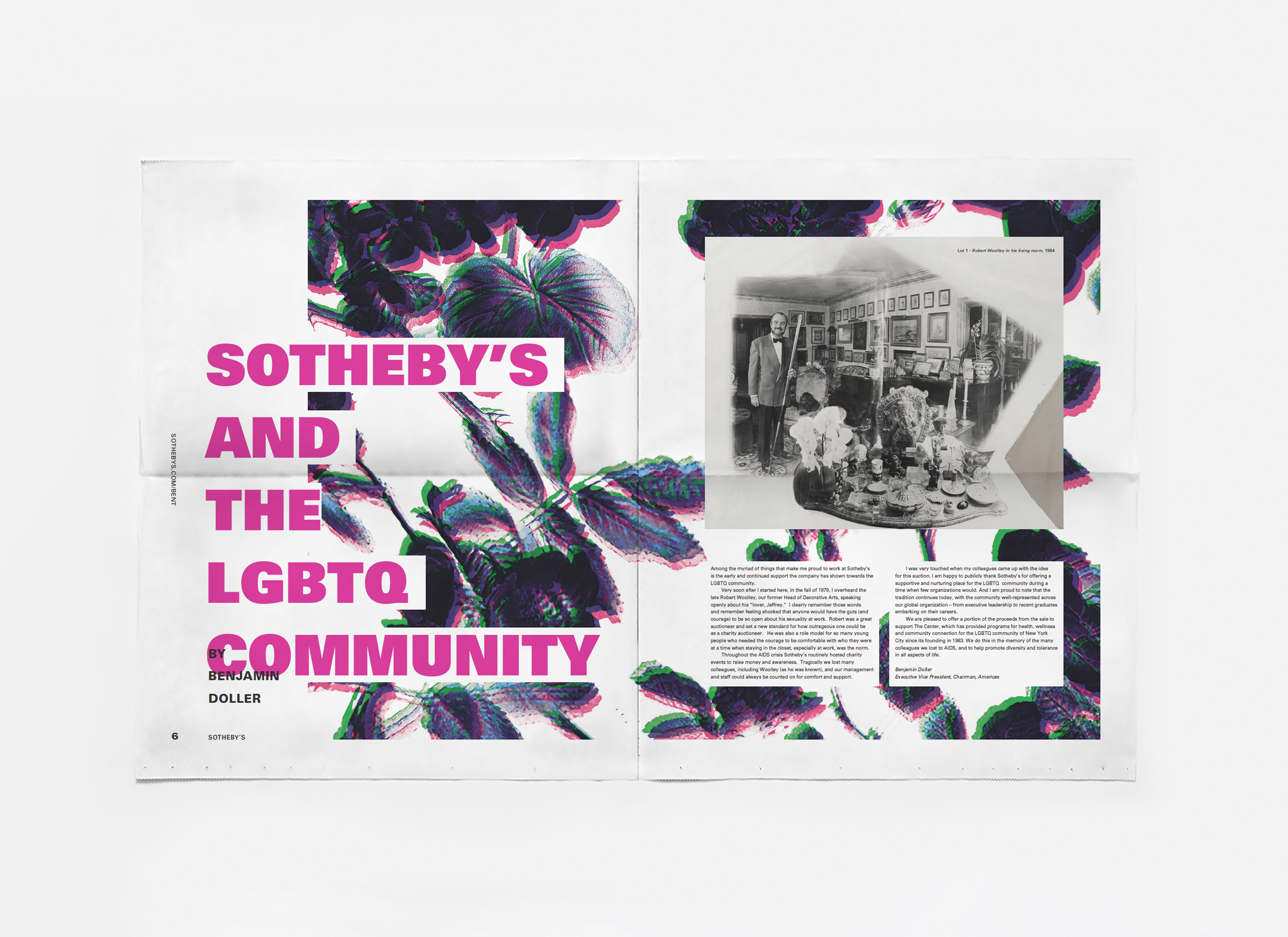
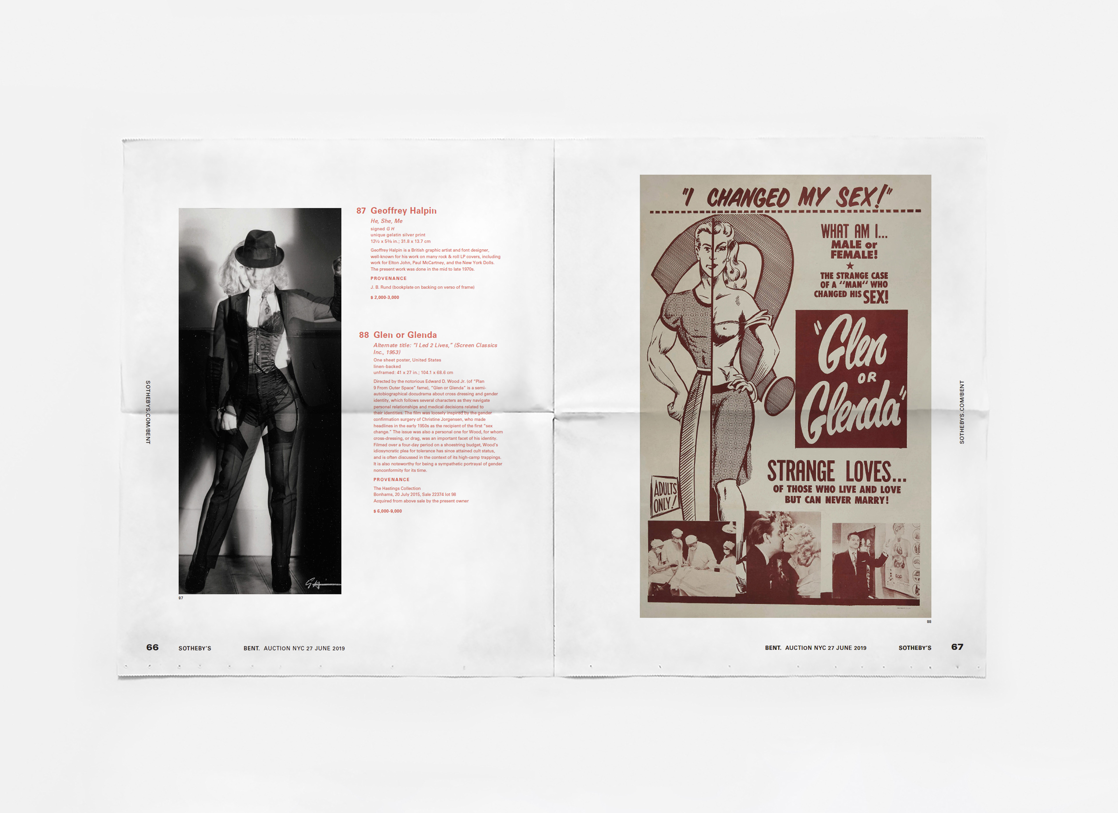
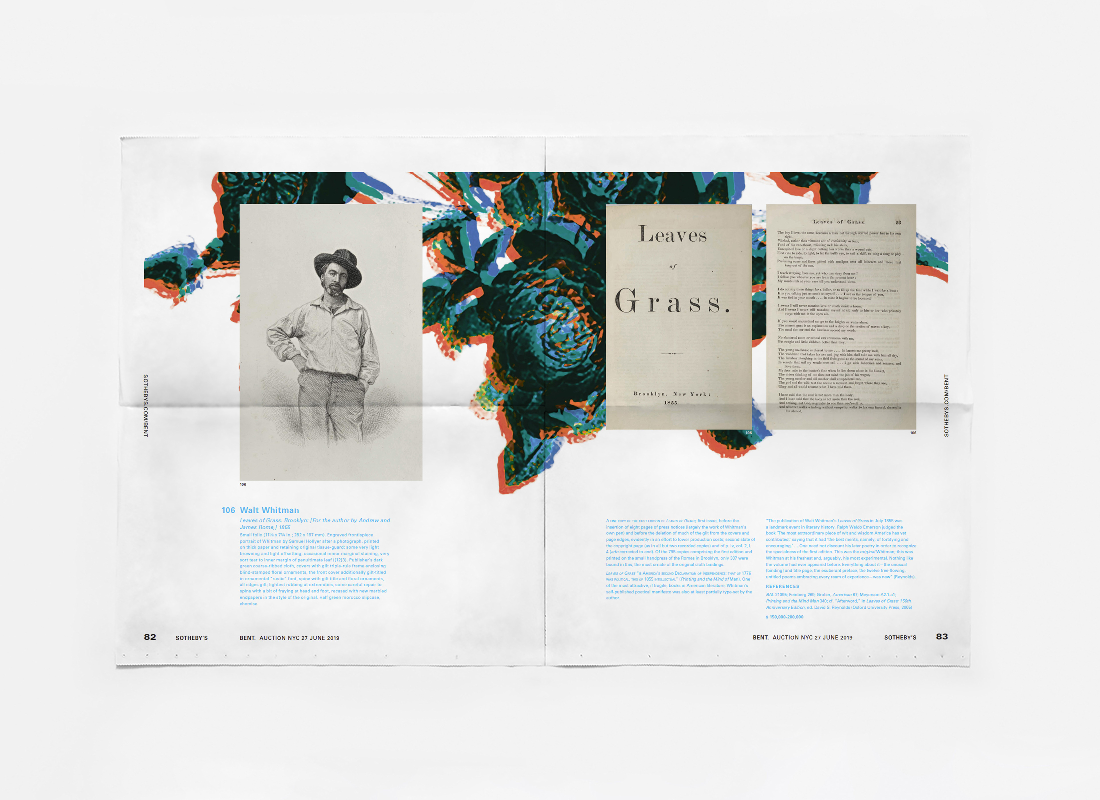
Zine creation and distribution has a long-standing history in queer activism going as far back as 1940. This way of marketing thrived in underground communities where it offered an uncensored, affordable way to share information. We wanted the sale’s catalogue to honor this lineage, so BENT. was produced as a four-section printed newspaper rather than a polished, traditional Sotheby’s catalogue. The format emphasized authenticity, accessibility, and mass distribution in large quantities. Copies were then placed in LGBTQ+ bars across Manhattan and Brooklyn as a form of guerrilla marketing.

Digital content
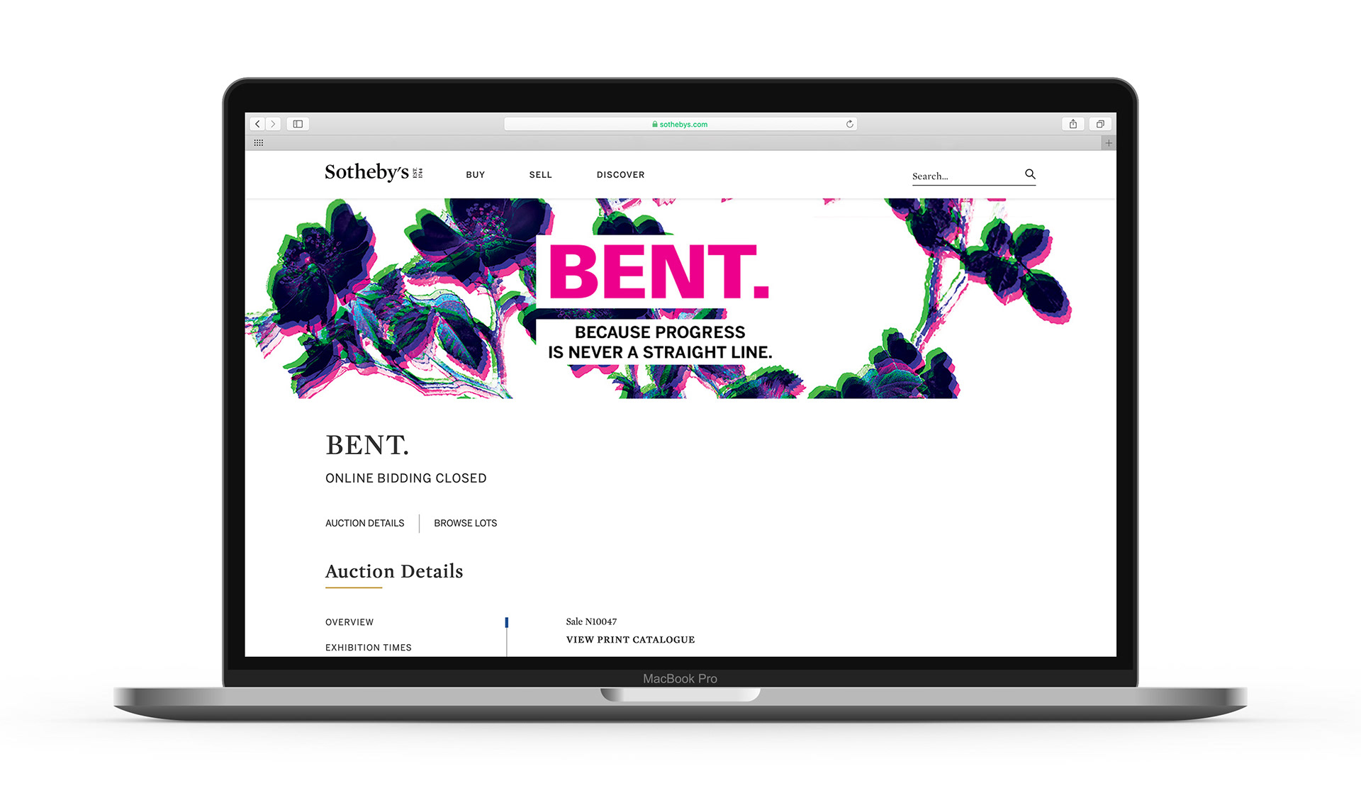
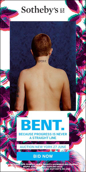
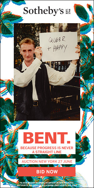
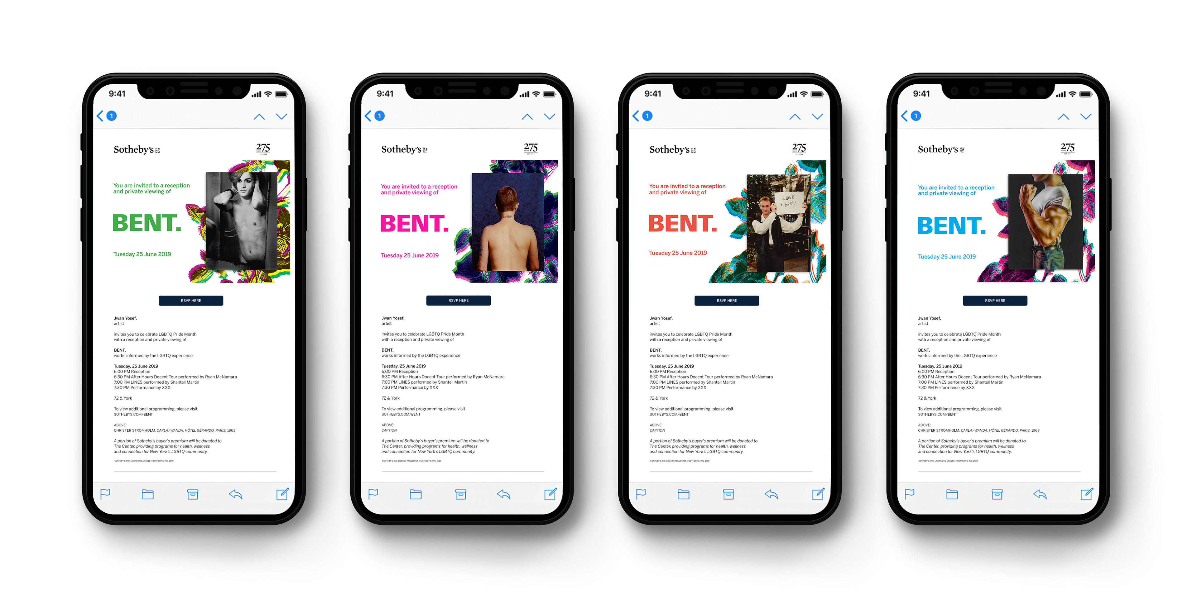
Web-banners, digital ads, and e-vites for event reception

Building signage
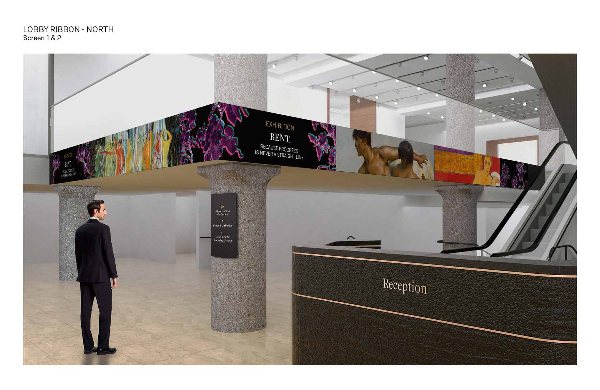
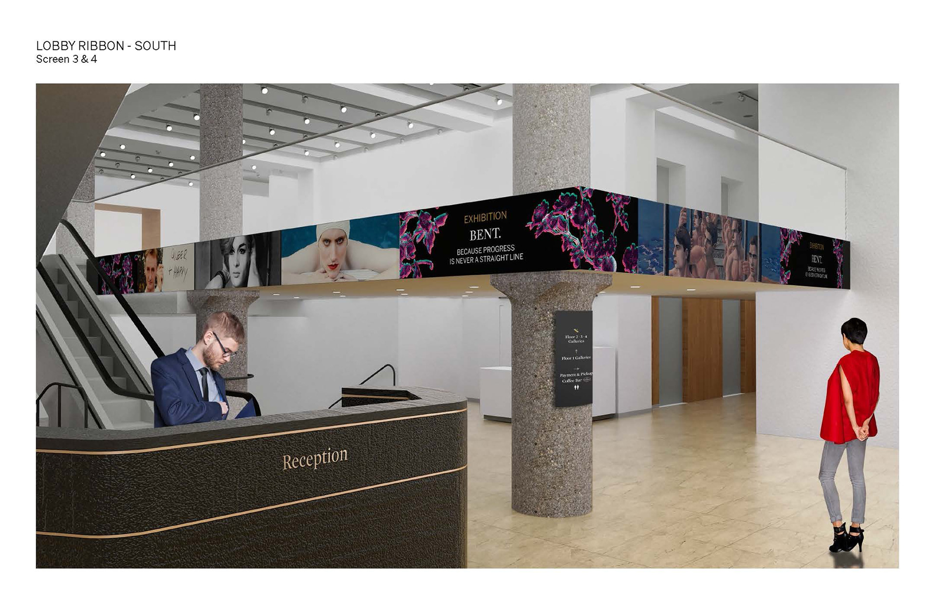
Digital lobby ribbons, digital elevator screens, and printed elevator signage following the Sotheby's branding.


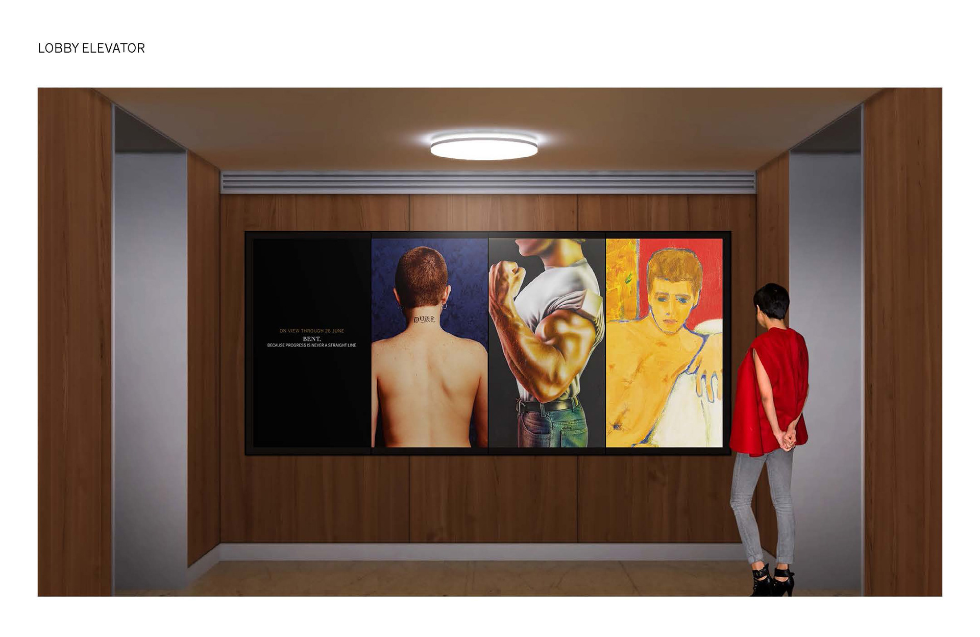
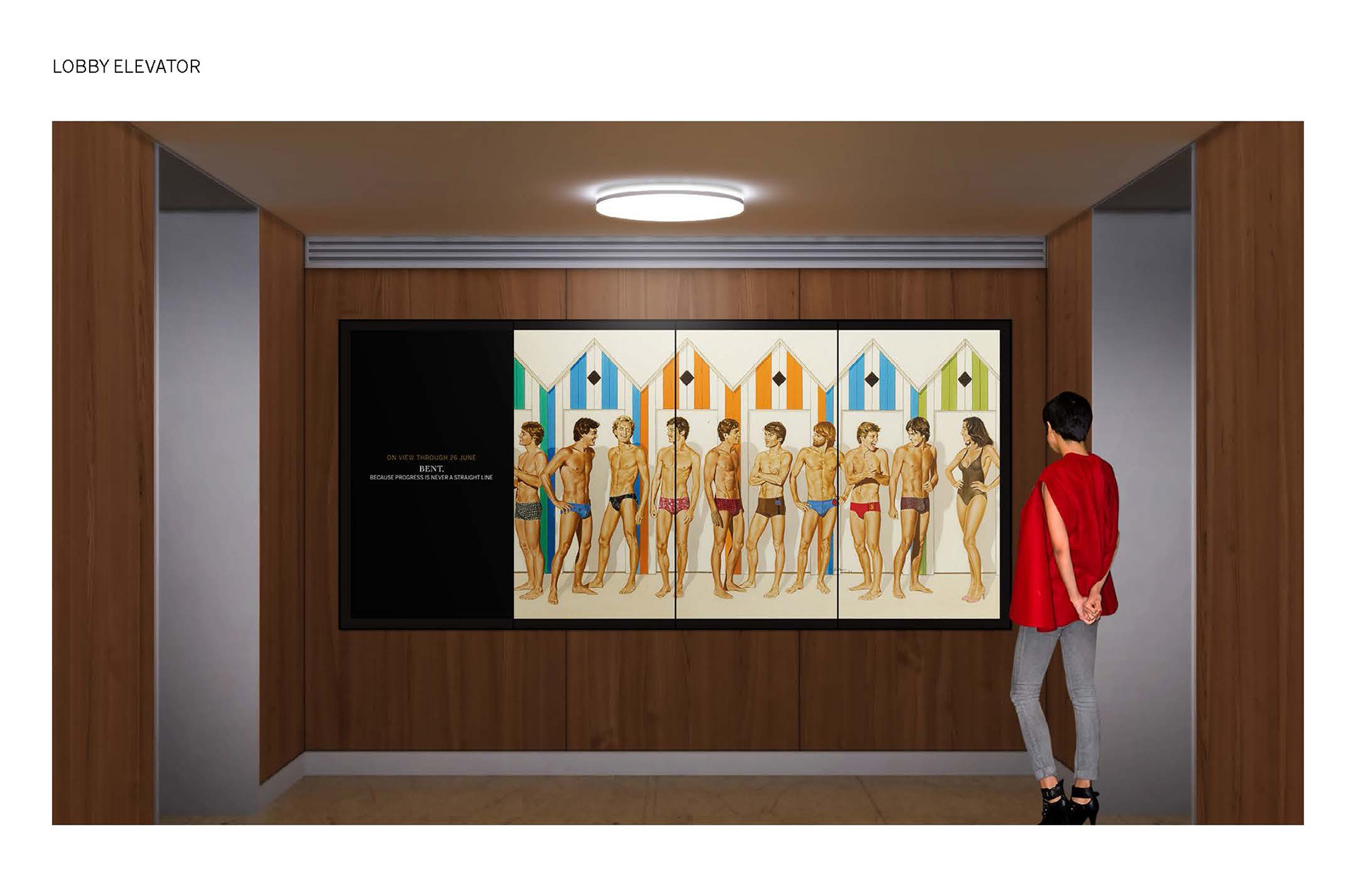
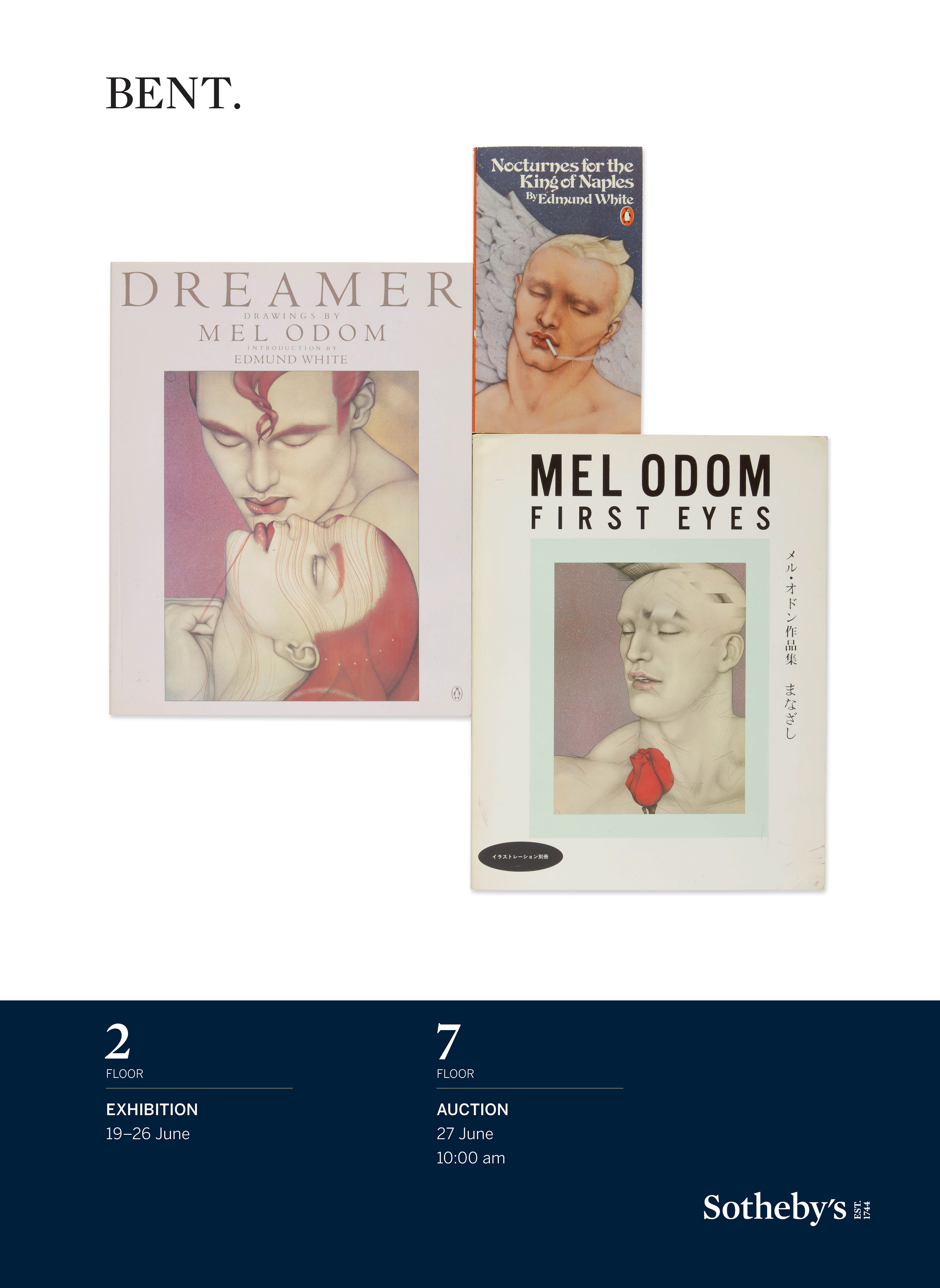
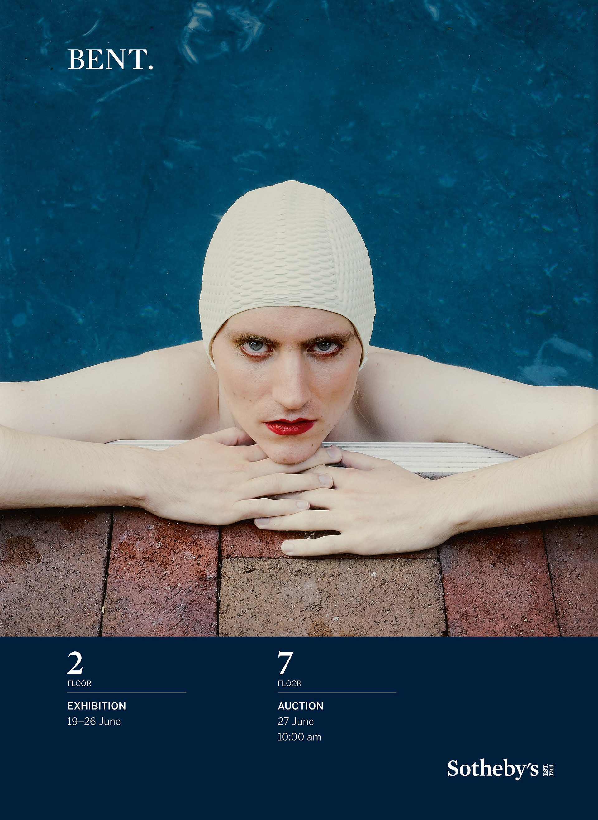
Bent. Installation and Reception
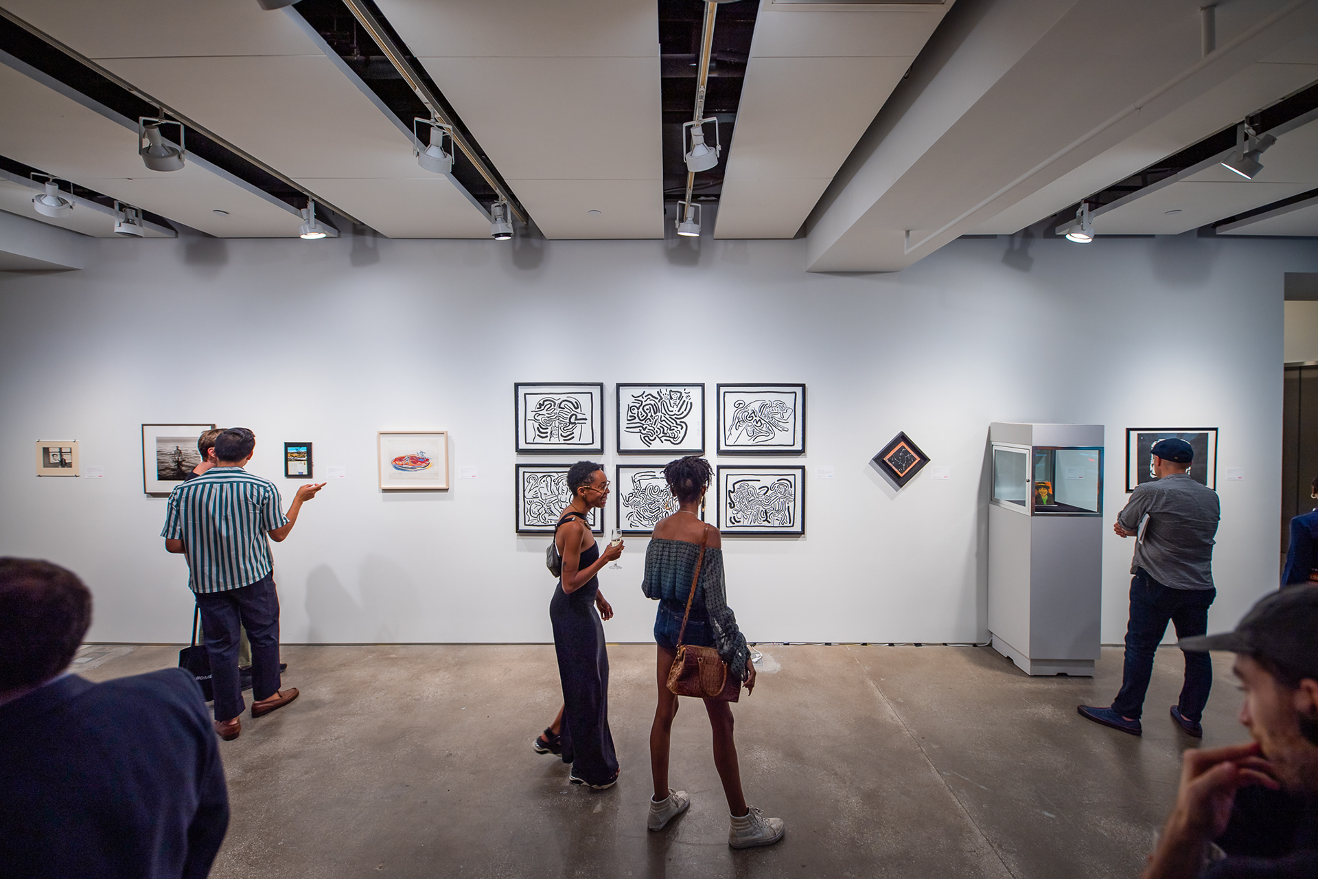
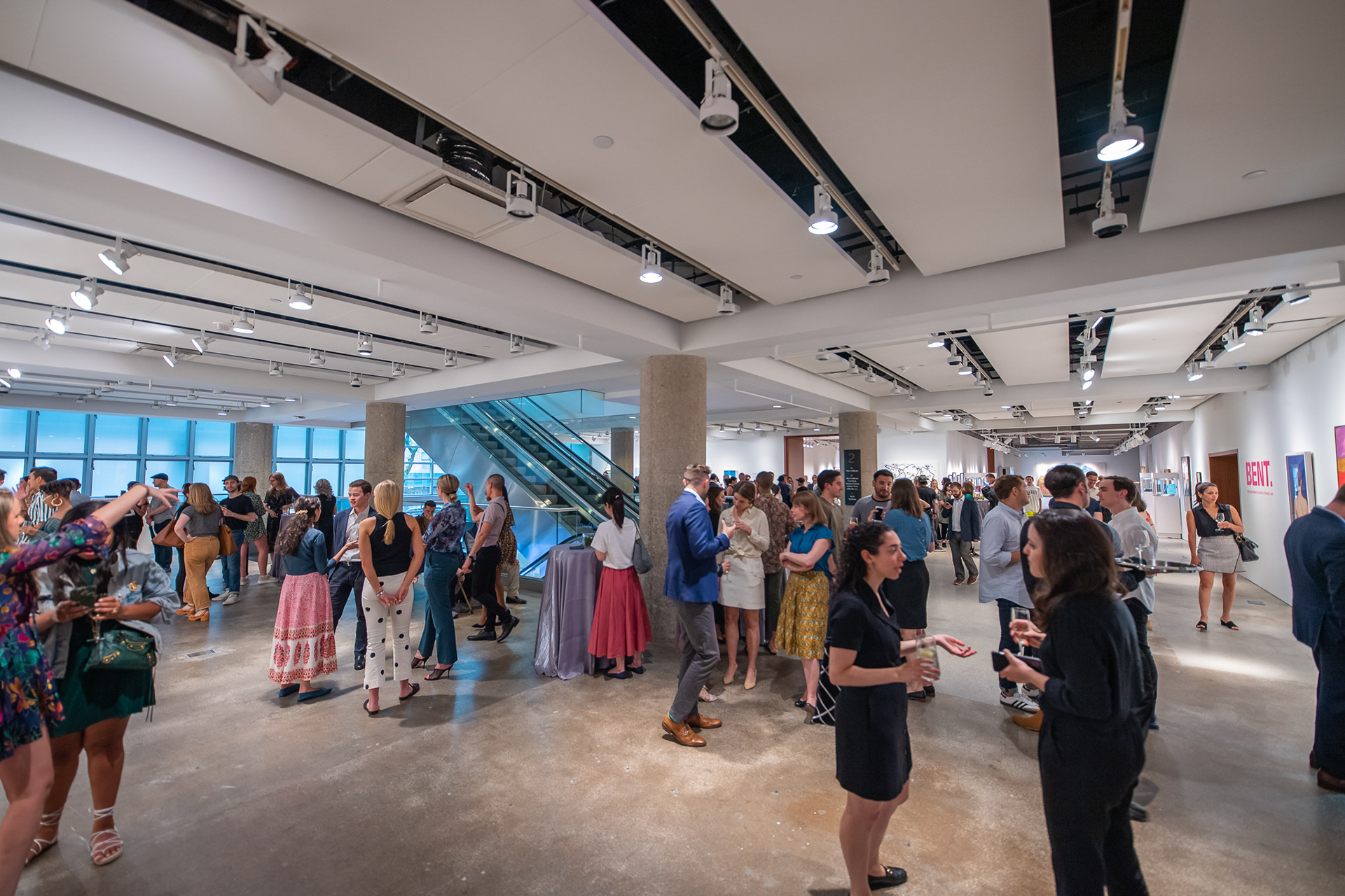
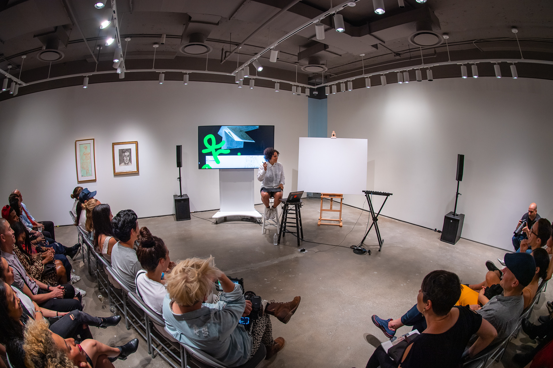
The BENT. reception took place in the gallery showing the 100+ works offered in the upcoming sale. It began with a night of cocktails, followed by a performance of LINES by Shantell Martin, an artist featured in the sale, who created a new work to be offered in auction.
